Game
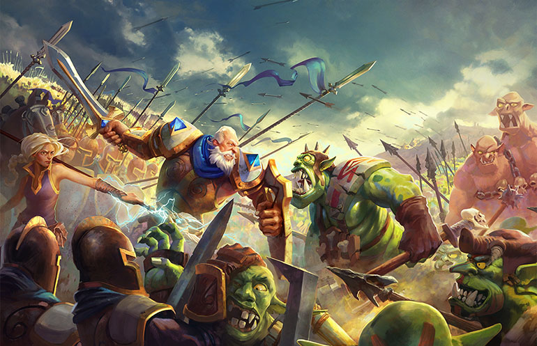
The turn-based strategy game built exclusively for mobile. Meet your enemies on the hex battlefield, and put your tactics to the test. Recruit, train and build your army to battle and conquer every opponent.
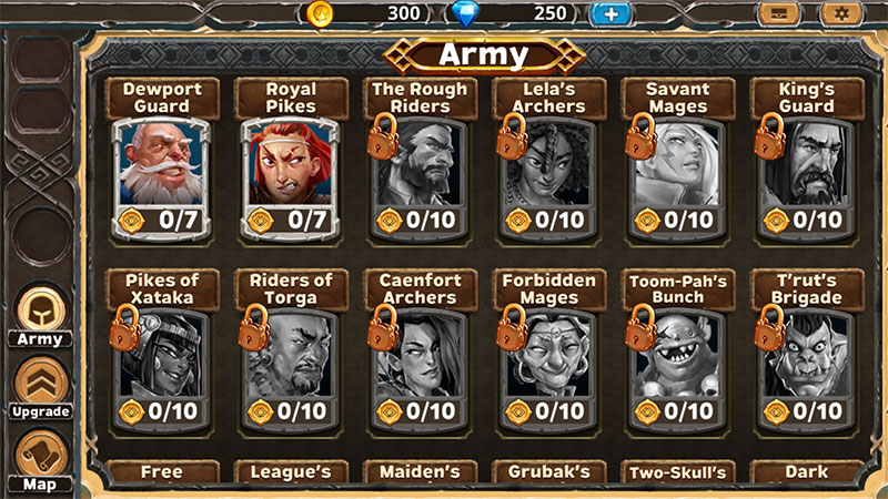
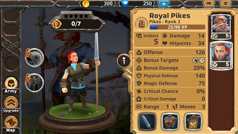
Collect and recuit dozens of unit types, and take your regiments from a handful of militia to a steeled fighting force. Equip and customize each unit and choose exactly how your army grows, from weapons and armor, to game-changing abilites.
Video
EPIC STRATEGY. HEROIC PROPORTIONS.
Breakdown
Early Days
While working at Wooga I was tasked to work on Warlords, back in the days when I joined we called it Codename: Hero. I started early 2013 and was doing concept validation and usability engineering in the beginning, while still having a prototype we startet testing on some players internally and this was already a great insight onto what direction this game needed to change.
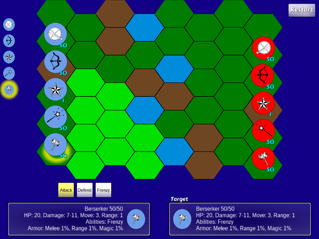
Initially you had a player customizable Hero unit represented by the star here.
Kingdom
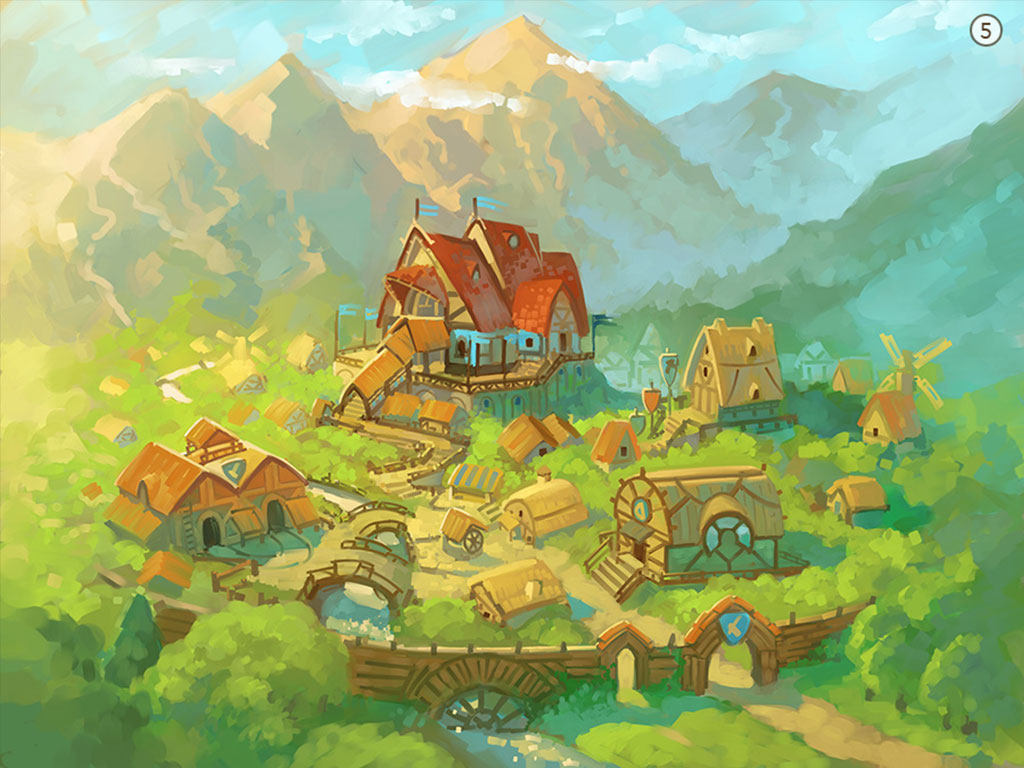
Back then this game had City Building aspects as well as unit recruitment and some late game tech trees which could be used to help giving you the last bits of stats and of course players would be able to upgrade buildings. This was very complex for some players as they only wanted to play battles and focus on the army rather than having a city to build. During the first year we iterated quite a lot on this premise and I was working on solving bottleneck UX issues. For example it took too many steps to place units on the battlefield or how the player would find the best fitting battle for him, building prototypes helped us as a team to focus on implementing the best solutions.
New Direction
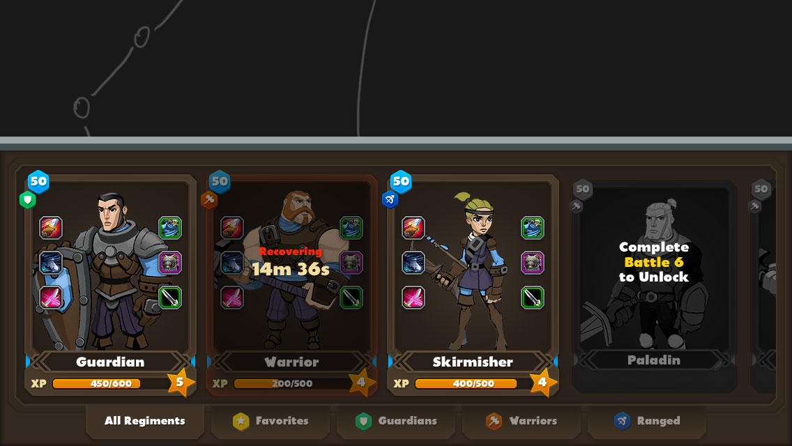
We decided to have heroes for every Regiment.
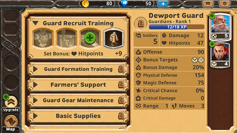
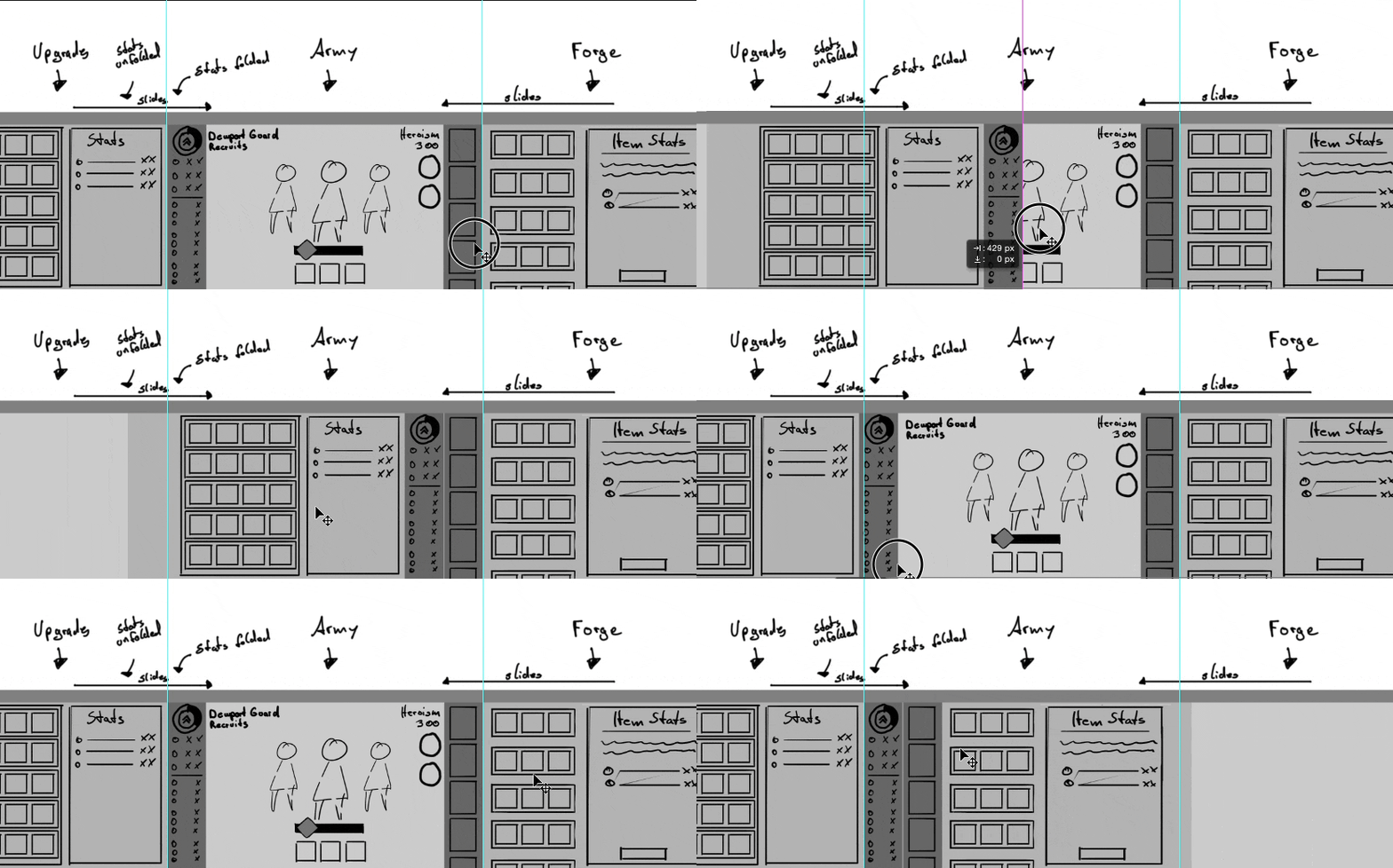
With all the data gathered during pre-production we had a new goal in our hands but it would still take us a lot of iterations to come to the finished Product. One major change was that we had direct upgrades for units instead of going into a town and clicking through buildings, we needed a new hub and decided to go with full screen UI Panels. You would start the session on the World Map directly seeing available Battles and Rewards without clustering the screen to much with unnecessary information.
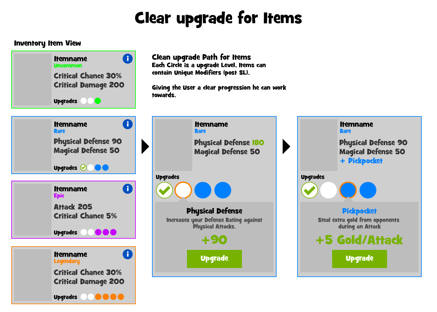
The upgrade path needed to be as clean as possible, we designed a system which would allow users to directly apply said upgrades but still maintaining the choice a player would make throughout the game.
World Map
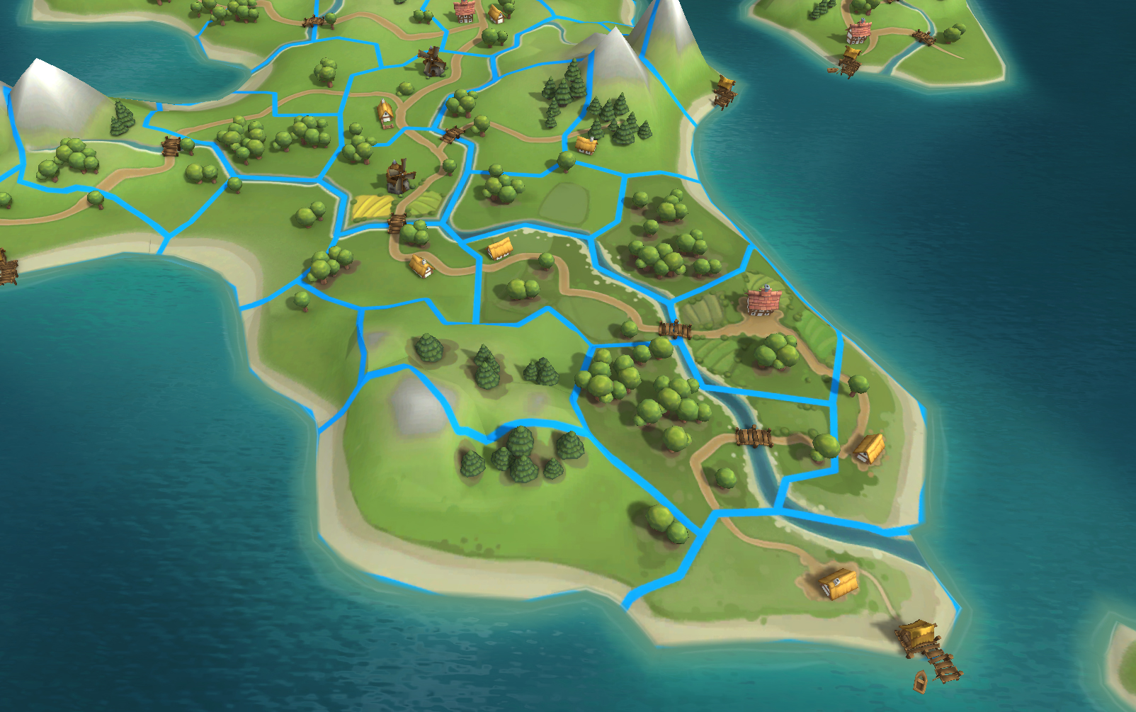
We build a system for the World Map which would have enemies conquer back some of the Shires. Making it more dynamic each session and also spawn stronger enemies. Giving you better rewards after each Battle.
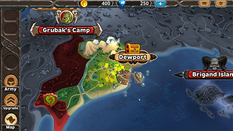
Over time we also worked on additional systems to make the world feel more alive. The Dewport Harbour has ships arrive based on a timer with free loot. Players can trade with gold and diamonds for upgrades , weapons and armor. We also introduced the Brigand Island where players are able to fight 3 battles in a row. Collect shards and unlock units based on challenges. Boss battles like Grubak would introduce the player to high risk, high reward battles with unique loot for your units.
Battle
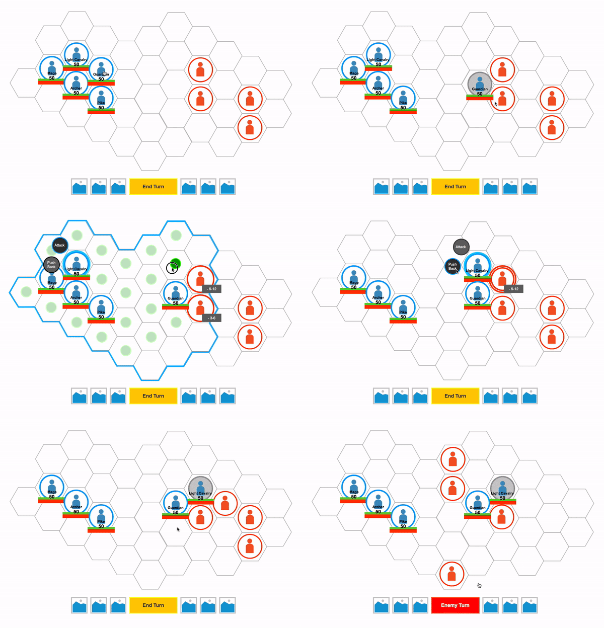
While the combat was still in tact from the prototype we had to iterate a few more times to nail the fun, since we threw out all the city building systems and build the unit progression system we needed to support that through the battle as well, during this time I was working on some combat prototypes where we also touched some of the interaction and decisions the player would make, all in all making it easier and faster to use. With the battle prototype we were able to adjust quickly on designs made on the board game which we used to generate ideas, I would then translate them in the prototype and see how it feels. Once we felt comfortable I started working close with the engineers to ensure the implementation was on spot.
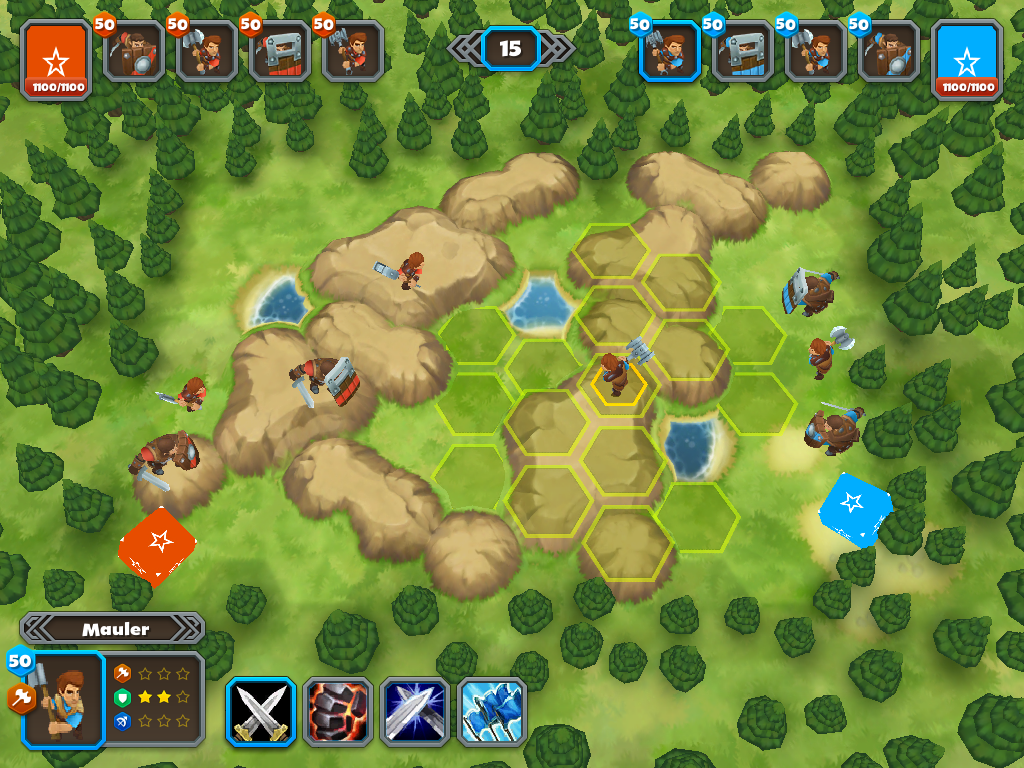
Working on the Battle System for so long has showed us that it is never really finished. Comparing the very first iterations we had with the final release you could say it is a different game. A lot has changed since then, we initially had units doing bonus damage on some targets which was very complex and ended up with a rock, paper and scissors mechanic where certain units would be very good against other units.
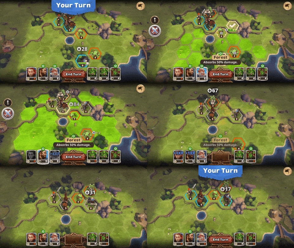
Evaluation
But we wouldn’t stop with the implementation, throughout the process of this game we continued to iterate on several features to always satisfy the players. After we finished the feature we would all sit down in a room and play the game, writing down what we liked, what we disliked and what was missing. At a later point, we would also invite external people for play testing and user research. Observing how players play your game is significant to the development process, adjusting only a few mechanics can make the player already more engaged making it less likely that they put your game down and download the next one.
Ensuring overall quality I also worked on some Game Design documents, validating ideas for the general audience and making it easier to approach. Working on multiple features I also created evaluations and design ideas, some of them you can find here:
Contact
Play Warlords and let me know what your thoughts are! If you want to craft a game for a big audience or you want to know more about this project. This is your opportunity.

